The Launch-Ready Landing Page System for eCommerce: Pre-Launch, Drop, and Evergreen Templates That Convert Paid Traffic

Paid traffic is getting pricier while shopper attention is getting shorter. That combo makes your landing page the profit lever that decides whether your campaigns scale or stall. Recent platform data illustrates the stakes. The average landing page converts at a 6.6 percent median across industries, based on an analysis of 41,000 pages and 464 million visits from Unbounce’s 2024 benchmark report. According to Unbounce’s Q4 2024 dataset, that 6.6 percent number is a true median meant to temper outliers, and it is the baseline your paid traffic has to beat.
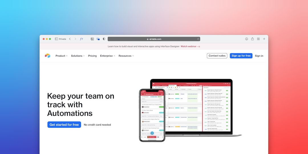
At PixiGrow, we build eCommerce landing systems that consistently beat baselines. Our subscription design studio is built for startups and growth teams that need fast, conversion-focused creative without the hiring overhead. From brand to copy to motion to analytics, our team delivers launch-ready pages in as little as 24 hours through async, Slack-first collaboration. Explore our plans or say hello on Slack-based contact to see how we work.
This guide lays out a practical, repeatable landing page system that maps to the three moments every eCommerce brand cycles through: Pre-Launch, Drop, and Evergreen. Use it to turn paid traffic into revenue on Shopify and beyond.

Why a launch-ready system matters now
There is little room for inefficiency when clicks cost money. Facebook traffic campaigns average a 0.77 dollar CPC across industries, and lead campaigns average a 1.88 dollar CPC, according to WordStream’s 2024 Facebook ads benchmarks. On mobile, the bar is higher again. Mobile now accounts for more than 60 percent of all web traffic and over 70 percent for eCommerce visits, which the OuterBox 2025 mobile eCommerce report highlights as a continuing trend.
Speed is the other constraint. Site speed has a direct, measurable impact on conversion. In Portent’s study of 100 million page views across B2B and B2C, a site that loads in 1 second has an eCommerce conversion rate 2.5 times higher than a site that loads in 5 seconds. The Portent analysis recommends a 1 to 2 second target for transaction pages, showing conversion rates peaking around that window.
Checkout friction is the final tax. The average cart abandonment rate is 70.22 percent across 50 studies compiled by the Baymard Institute. Baymard’s research further shows that design fixes alone can yield a 35.26 percent conversion lift in checkout usability, and that 18 percent of shoppers abandon orders due to a checkout that is too long or complicated. Their list of top abandonment reasons includes extra costs, forced account creation, and lack of payment options, which your landing templates must preempt.
Video also belongs in the toolbelt. In the latest annual study from Wyzowl, 87 percent of people report being convinced to buy a product or service after watching a video, and 93 percent of marketers say video delivers a good ROI. Short, clear explainer clips on the page can lift engagement and help conversion when they address specific objections.
In short, the templates you use need to handle speed, mobile clarity, message match, and checkout readiness by default. That is exactly what the Launch-Ready Landing Page System delivers.
Your three-template system for paid traffic
Think of your landing pages as modular plays you can deploy based on demand cycles. You need three:
Pre-Launch page for teasers, waitlists, and list building before inventory lands
Drop page for time-bound releases and promotions that need urgency
Evergreen page for always-on acquisition that complements product pages
Each template uses the same building blocks but arranges them to fit the moment. This keeps production fast and testing continuous while maintaining consistent brand and performance fundamentals.

Pre-Launch template: list building that warms cold traffic
The Pre-Launch template is your audience magnet. It converts curiosity into owned attention so that when you flip the switch on launch day, you already have buyers queued.
What it does best
Captures email and SMS with a clear value exchange like early access, limited quantities, or founder pricing.
Seeds social proof early with brand story, press pull quotes, and first-look UGC.
Teases the hero benefit with a short explainer video. Since 78 percent of consumers prefer short video to learn about products, per Wyzowl’s consumer data, a 30 to 60 second reel is a high-leverage addition.
Preps the pixel. Optimize events for view content and lead, then build warm audiences for drop day.
Suggested module order
Above the fold: attention-grabbing headline that mirrors your top ad, quick value prop, single opt-in field, and a primary CTA like Get Early Access
Proof bar: badges or press logos and 1 to 3 tight testimonials to build trust
Benefit stack: three punchy blocks with outcomes, not features
Explainer video: a short, captioned clip that answers what it is and why it is different
Founder note or brand story: a personable paragraph that raises affinity
Secondary opt-in: one more chance to join, with SMS optional
Footer compliance: privacy language and clear unsubscribe to avoid deliverability issues
Performance notes
Keep the form easy. Baymard’s testing shows 18 percent of shoppers abandon when forms are too long. Aim for one field for email or phone on the top section, and defer optional fields to a second step.
Make it blazing fast. The same Portent study correlates the biggest conversion gains in the 1 to 4 second range. Optimize images, lazy load below-the-fold assets, and defer noncritical scripts.
Shopify readiness
If you run waitlists on Shopify, use a theme section or app to add subscribers to a collection-specific list, then create a customer segment in Shopify Email for launch announcements. To tailor your Shopify storefront around the reveal, check out PixiGrow’s take on theme polish in Customizing your Shopify store.
Drop template: launch with urgency and frictionless checkout
Drops compress attention. You win by removing friction and increasing urgency without resorting to gimmicks. The Drop template is a direct response page purpose-built for paid traffic on the day you launch.
What it does best
Creates time pressure with inventory context, a clear launch window, and smart scarcity like limited colors or bundles.
Uses UGC and creator clips to overcome objections quickly.
Accelerates checkout by surfacing Shop Pay and one-click options.
Why Shop Pay matters
Shopify commissioned a Big Three consulting firm to study checkout conversion across major platforms. The resulting Shopify report states that Shopify’s checkout converts up to 36 percent better than competitors on average, and that Shop Pay can lift conversion by as much as 50 percent compared to guest checkout. The same analysis notes that simply showing Shop Pay can increase lower-funnel conversion by 5 percent. If you are on Shopify, that is a lever worth designing around.
Suggested module order
Above the fold: product hero with immediate Shop Now CTA and Shop Pay iconography, a launch badge like New Release or Limited Drop, and a micro-proof element like a star rating
Countdown and availability: honest inventory framing, not fake timers; explain what sells out first
Social proof blend: 2 to 4 short UGC clips, star reviews, and one longer testimonial that highlights an outcome
Benefits and specs: clear bullets and a scannable comparison if you replaced an older model
Offer and bundles: tiered value that rewards AOV without forcing it
Checkout options: reinforce Shop Pay, PayPal, Apple Pay so buyers pick a trusted path
Performance notes
Match ad to page. If your ad promises a bundle price, the headline must repeat that. WordStream’s benchmarking reminds us that Facebook’s traffic CPC averages under a dollar for most industries, but clicks only matter if message match and continuity stay tight from ad to headline to CTA. See their traffic objective CPC and CTR breakdown for context.
Make mobile first. Since mobile dominates eCommerce browsing and buying, as highlighted by OuterBox, design thumbs-first: larger CTAs, sticky add-to-cart, short copy blocks, and compressed video.
Shopify readiness
Use Shopify OS 2.0 section templates or a landing page app with Checkout Extensibility to place Shop Pay above the fold and in the sticky bar. Organize bundles as variants or separate products and use dynamic checkout buttons so buyers tap once and pay.

Evergreen template: scale paid and organic with a keeper page
Your Evergreen template is the always-on closer for your best sellers and hero collections. It absorbs cold traffic from Meta, Google, TikTok, and SEO, and it should outperform a standard product page because it handles objections in context.
What it does best
Tells a results-focused story for one product or a tightly curated set.
Anchors price against alternatives and sets value clearly.
Addresses the top Baymard abandonment drivers before checkout, especially trust and total cost clarity.
Suggested module order
Above the fold: promise-driven headline with a crisp image and one primary CTA
Transformations or use cases: three outcomes, each grounded in customer language
Proof ladder: customer quotes with names and verified badges, then a wall of UGC thumbnails
Offer logic: savings against price or bundles with real value math
FAQs: address shipping, returns, materials, sizing, and how it compares to X
Secondary CTA: try risk-free messaging with your returns policy summarized
Performance notes
Clarity over clever. Keep sentences short and verbs active. Mirror terms your buyers use in search and social.
Show full cost upfront. The Baymard reasons analysis pins extra costs and unclear totals as top abandonment triggers. Surfacing shipping thresholds and duty info on the page reduces checkout surprises.
SEO bonus
Because Evergreen pages are content-rich and internal-link friendly, they can double as acquisition assets for search if you integrate semantic headings and related terms. Publish them under your main domain and link from your nav. When you are ready to scale content production, PixiGrow’s blog has process-focused articles that show how we build systems founders can keep humming.
Creative and copy that pays off paid traffic
These five rules keep you honest across all templates:
Message match every time. Your headline must echo your ad’s promise verbatim. This continuity reduces cognitive load and bounce.
Make value obvious above the fold. One core benefit, one core CTA, one trust cue. No carousels, no dead space.
Use video to show, not tell. The Wyzowl consumer survey reports that 98 percent of people have watched an explainer to learn about a product and 87 percent have been convinced to buy after watching. Place clips where they answer the specific objection in that section.
Social proof early and often. A lone review at the bottom is not enough. Thread ratings, UGC, and expert quotes throughout.
Write for mobile. Test your first view on a 375 pixel width. If a user cannot understand the offer without scrolling, tighten it.
Technical checklist for speed, tracking, and trust
Target 1 to 2 seconds for transactional pages. Portent’s research shows peak eCommerce conversion in that window and a steep decline past 3 seconds. See their conversion by seconds chart for context.
Compress images aggressively and lazy load below-the-fold assets. Use WebP or AVIF where possible.
Defer nonessential scripts. Load analytics and A/B testing scripts after initial paint and move noncritical trackers to window loaded events.
Implement Meta’s Conversions API and Google’s server-side tagging where it makes sense. Better event fidelity equals better optimization.
Display trusted payment marks. Baymard’s abandonment reasons include lack of trust and payment methods. Put Shop Pay, Apple Pay, PayPal, and your returns policy above the fold on Drop and Evergreen templates.
Ad-to-page orchestration and personalization
Tight orchestration beats heavy personalization. Start with:
UTM-aware headlines. If utm_campaign has “bundle,” swap the headline to the bundle promise and expose the bundle block early.
Geo-aware shipping bars. Show local shipping ETAs and thresholds to lower cost anxiety.
Audience-specific proof. If the ad audience is retargeting, move reviews and creator quotes up. If it is cold interest, lead with category-level outcome and credibility.
This kind of modularity is a perfect match for a subscription design workflow. With PixiGrow you can request alternate variants and we will ship them as reusable blocks you can plug in by audience.
Shopify implementation guide
Shopify is a friendly stack for this system, whether you are on a stock theme or a custom storefront.
OS 2.0 sections. Build your templates as sections and use JSON templates to assign them to unique URLs. It keeps content manageable for non-technical teammates.
Checkout Extensibility. Add address autocompletion, trust badges, and a custom Shop Pay reminder on the information step. The Shopify enterprise blog explains how Shop Pay recognition and one-click speed deliver measurable conversion lifts.
Payments mix. Enable Shop Pay, Apple Pay, and PayPal. The presence of Shop Pay alone can give you a lower-funnel bump, per Shopify’s study.
Analytics. Configure GA4 ecommerce events, Meta pixel standard and custom events, and CAPI. Keep your consent banner light and clear.
If you are just getting started with Shopify or spinning up a new storefront, it is hard to beat its speed to value. You can sign up with our partner link to get moving quickly on Shopify.
Testing roadmap that compounds
You do not need a lab to test. A simple weekly cadence compounds:
Week 1: Headline promise tests mapped to your top ad groups
Week 2: Above-the-fold layout variations for mobile first view
Week 3: Offer framing tests like bundle vs gift with purchase
Week 4: Social proof density and placement
Track lift against paid channel baselines and run winners for full cycles. Unbounce’s dataset reinforces that benchmarking by industry matters, but your own page plus traffic mix will find its own ceiling. Use that 6.6 percent median as a sanity check while you optimize upward.
How PixiGrow executes the system
Our model exists to make systems like this easy. You drop ideas in Slack, we ship conversion-ready assets fast. Here is what that looks like in practice:
Essential at 999 dollars per month. Best for foundational needs like one Launch-Ready template, brand refresh, and a round of ads to match. Expect quick updates, Slack-based async collaboration, and template libraries you can reuse. Details on the PixiGrow homepage.
Premium at 1,499 dollars per month. Best for ongoing growth work like multiple simultaneous tests, motion graphics, advanced analytics and reporting, and unlimited active requests and revisions. This is the mode fast-scaling teams prefer.
Clients choose us for predictability and speed. No contracts, pause anytime, and responses inside Slack without the meeting drag. Our team has shipped work that helped 76 clients generate 420 million dollars plus in revenue, and our leadership experience spans Meta, Google, and Apple. If you want the backstory and approach, visit About PixiGrow. If you want to see more of our thinking, browse the PixiGrow blog or our posts on running creative teams like From vision to execution.
A one-day launch plan you can reuse
9:00 AM: Align your ads to one promise, one offer, one primary audience. Build at least two headline variants that mirror your best ads.
10:00 AM: Assemble the right template. Pre-Launch if you need list building, Drop if you have a timed sale, Evergreen if you are scaling a hero product.
11:00 AM: Add proof and a short video. Use customer language, not brand speak. Keep the clip under one minute with captions.
12:00 PM: Shop Pay and mobile QA. Verify accelerated payment methods and test the flow on a midrange phone and 3G throttling.
1:00 PM: Speed optimizations. Compress, defer, and lazy load. Confirm time to first byte and LCP are green.
2:00 PM: Tracking and events. Verify GA4, Meta pixel, and CAPI. Test purchase events and audiences.
3:00 PM: Launch with controlled budgets. Monitor real-time metrics and record the first 100 clicks’ behavior with a lightweight session tool.
5:00 PM: Ship variant 2 for a headline or layout test and let it run to significance.
That entire workflow is the kind of thing we ship on the Essential plan without breaking stride. If you would rather not juggle designers, developers, and multiple agencies, start with PixiGrow and we will make this system your new normal.